Question 2
HOW EFFECTIVE IS THE COMBINATION OF YOUR MAIN PRODUCT AND ANCILLARY TEXTS?
Branding within media and especially the film industry, is important to have a certain and iconic image so that people can identify the image with your product. Many people use the iconic image factor to make their product better and easier to be identified by the audience as well as people who don't yet know the product. The way in which an iconic image can be shown is with a character, prop, persona, logo or even fonts.
Iconic imaging
|
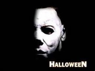
This iconic image of Michael Myers from John Carpenter's Halloween (1978) has been identified since the film has come out nearly 40 years ago. However, the image of the mask of the infamous slasher has always been in the mind of any person to either watch the film or even just glance upon the film's title. The reason of it's uniqueness is the fact that for a antagonist of a horror, he is such a simple design. Compared to other horror related characters like Freddy Krueger or The Thing, it is much more of a simple design and concept rather than a confusing look upon a confusing storyline. The image also include the unknown as around the mask there is just pitch darkness which shows how the horror is about a killer who hunts in the dark.
|
|
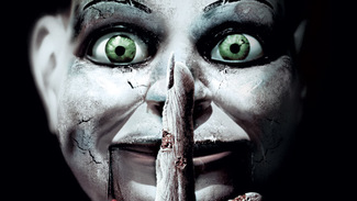
Recently in horror movies there have been a lack of iconic images or just iconic images that have been copied or manipulated to look slightly different for example the re-makes of Halloween (2007) and Friday the 13th (2009). Dead Silence (2008) a movie that has gone against this and instead created their own iconic image in the image of a puppet which is seen as threatening and also different to any other puppet in any film. The puppet is shown to be in this image as quite a damaged and old looking icon, which just adds the chills to the viewer of the image.
|
Iconic fonts
|
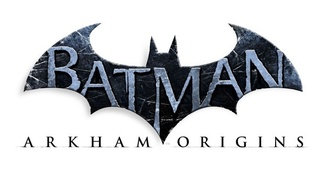
The Batman Arkham games (2009-2015) include a very clear font which to gamers around the world is obvious. This may not be a film, however, it shows how even a smaller audience of media can recognise an iconic font no matter what type of media it is. The Batman games show the way in the protagonist, Batman, has to deal with antics and many problems around the fictional city of Gotham and how he has to help the city that he loves. It is a hugely popular series within the gaming community and has sold millions of copies worldwide, which is the reason that the font is so iconic and memorable to people.
|
|
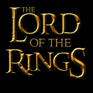
The Lord of the Rings trilogy (2001-2003) is argued to be one of the best series of films ever created. Now, because of this mass popularity around the films, their font has become their iconic image instead of any of the in film personas. It shows how even if the film is incredibly well-made and successful, the font of your product is still vital for your product to be recognised.
|
Our Main Product
Magazine Analysis (Before and After)
We wanted our magazine to be suggestive of horror rather than straight out obvious. With the fact that any age range can see the magazine, we wanted the magazine be more suggestive of the horror genre.
With this in mind, we wanted our magazine to be standing out without the needless blood and gore which other horror magazine covers depend upon for sales. The suggestive horror aspect of our magazine can infer a lot about our horror and so the audience can make their mind up or want to delve deeper in to wanting to see the film.
With this in mind, we wanted our magazine to be standing out without the needless blood and gore which other horror magazine covers depend upon for sales. The suggestive horror aspect of our magazine can infer a lot about our horror and so the audience can make their mind up or want to delve deeper in to wanting to see the film.
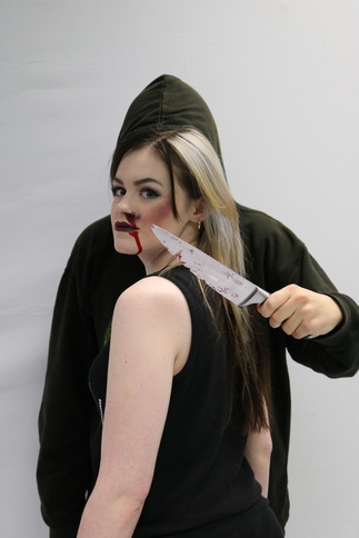
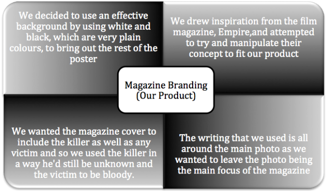
Original PictureTo get this original image, we used some our own made blood using chocolate and syrup to create a thick looking paste, similar to that of blood. We also had the killer standing behind the victim to show how the killer will be very secretive and dangerous shown with the knife.
|
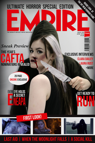
Final MagazineOur final product turned out to have quite a shaded border to put the entire cover into a more eery feel to it. We then wanted the outstanding parts of the image to be away from the more standing out writing around the magazine. We also used the famous magazine, Empire, to use to show the reality of a horror magazine cover in use.
|
Poster Analysis (Before and After)
With pour poster we wanted it to stand out but have as little revealing of the film and trailer as we could.
Thus, we wanted to show that there were dancers targeted and nothing more so it would leave more of an inconspicuous feel to the audience.
Thus, we wanted to show that there were dancers targeted and nothing more so it would leave more of an inconspicuous feel to the audience.
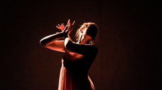
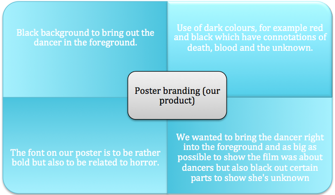
Original PictureWith the original picture, we used the school's drama studio to provide a rather dark atmosphere to the photos. We then used the lighting to provide a red upon the dancer to provide connotations of violence.
|
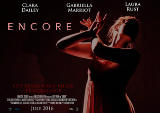
Final PosterTo get this finished poster, we wanted to put the entire subject to the rights to show that she may be being attacked or fleeing. We then wanted to involve all the titles around the darkness left. To then use the red lighting, we put the titles in a dark red to provide an uncomfortable atmosphere with connotations of violence, death, and the unknown.
|
Trailer Analysis
Analysis
|
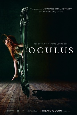
Oculus (2013)TitlesThe title is left to be quite out of the way like our own and shows an entire unknown to the movie poster which could show how the movie may play out. The title also shows a reflection of the victim coming out of the mirror which may show how important the mirror may be to the entire story and draw the audience to question the poster and so question how the movie will turn out. The slogan also shows how the movie will be based all around the mirror shown in the middle of the poster.
PhotographThe photograph used as the background of the poster shows the mirror being the majority of the plot as it splits the rest of the photo to the titles. It also shows a wooden floor as well which also shows how it will take place in a home and inferring you will never feel safe. It also shows the main character and maybe the main antagonist for the movie, which could help show off the movie. For example if fans of the actor want to see her in another film then it might attract them to the film. Same for the antagonist being something no one has seen or used before, the use of the mirror is unique and so could give the film more of a chance against other horrors.
|
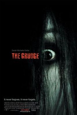
The Grudge (2004)TitlesThe title in the poster is moulded into the dark black hair to show how the antagonist as well as what is in the darkness is all unknown. The main subject in the poster is also pushed to the right to show that the antagonist is not only unknown but also rather shy, secretive, or just socially inactive. The slogan at the bottom also gives the audience more of an impact when they come to reading it showing the antagonist neither to be male nor female.
PhotographThe use of the photograph is very innovative as it uses the dark hair of the antagonist, also known as the Grudge, is used as more of a background rather than part of the antagonist. Apart from that, the photograph is rather plain and there isn't much else to it. The eye of the Grudge is more of an intimidation towards the audience that see it. With the main antagonist also being in the poster, it shows how it will be a crucial part to the entire story and so the audience will be expecting it to arrive when the film eventually came out.
|
|
